Levers Health
Redefining A Brand’s Identity For Effective Customer Communication & Recognition
Team
Eliza X. Shepherd: Creative Strategy Lead
Kostas Fragoulias: Meta Ads Manager
Dan Marrion Puzon: Video Editor
Project Background
Levers Health is an online pharmacy that offers performance medicine and weight loss programs that target females 30+.
The brand struggled to:
⚫ Maintain a consistent identity across their digital platforms.
⚫ Find appealing, eye-catching ads that would stand out from the highly competitive marketplace.
⚫ Find ads that would not get flagged by Meta

Brand Guidelines
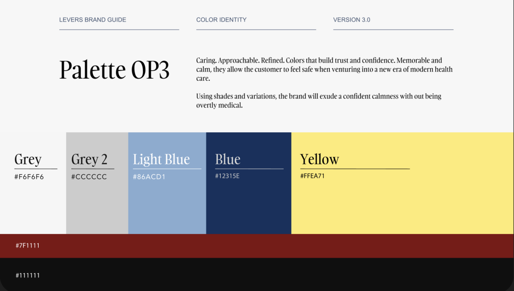
Here are the brand guidelines I was given.
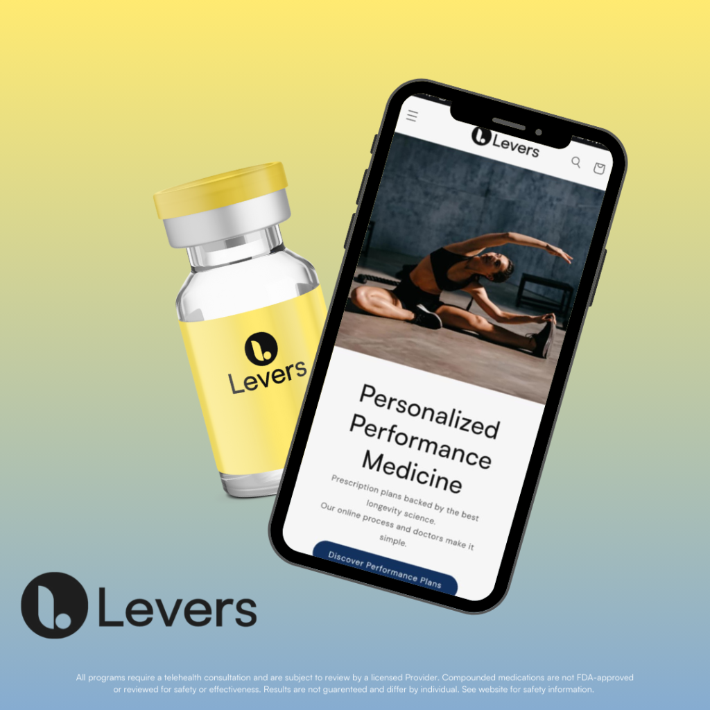
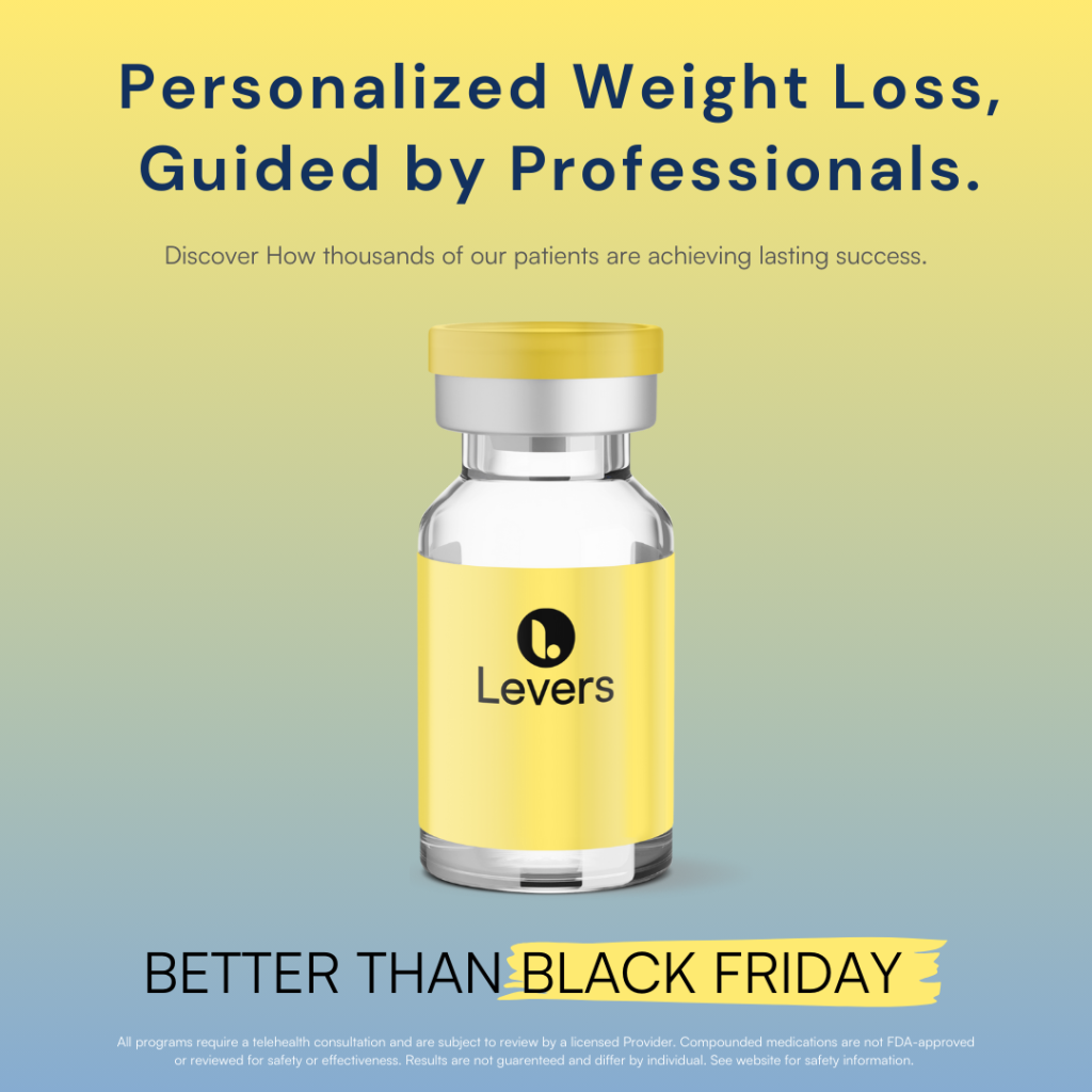
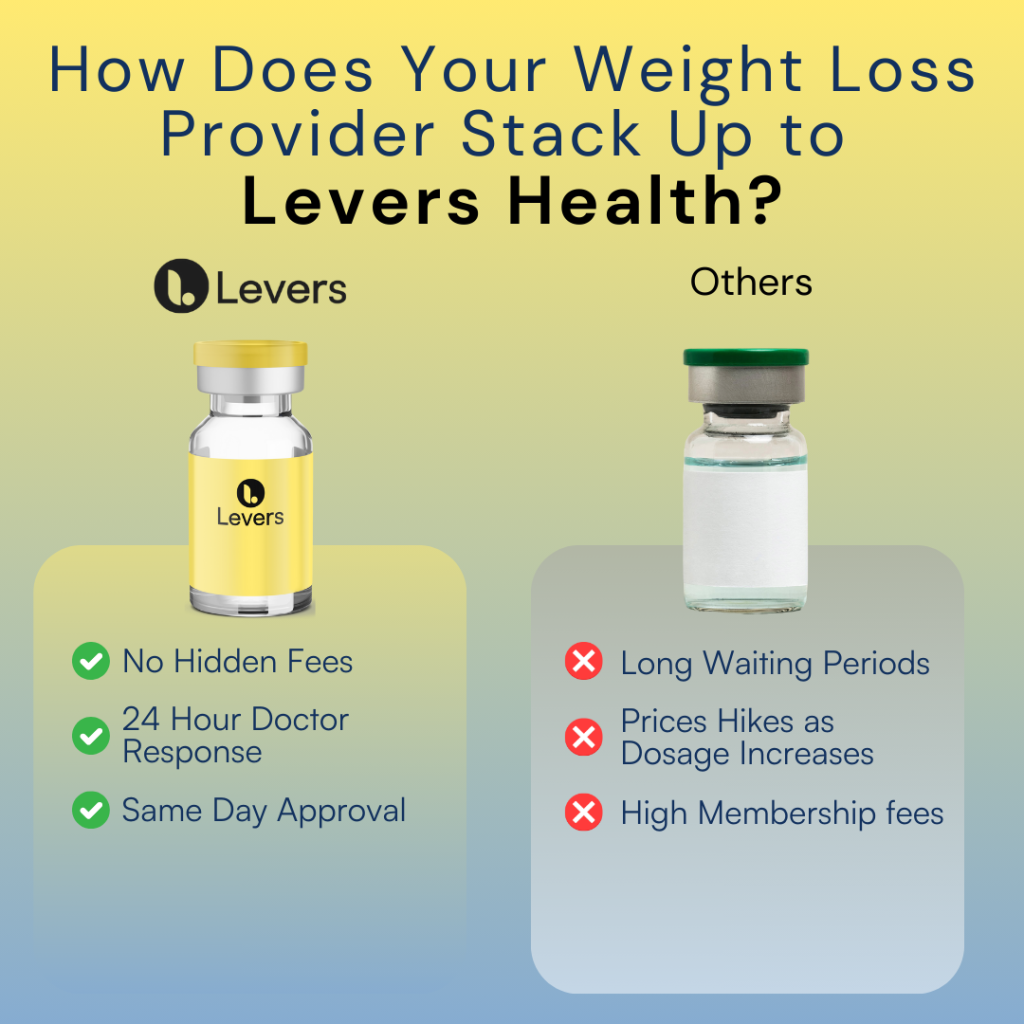
When rebranding, we knew that we wanted to stay within the blue/yellow color scheme.
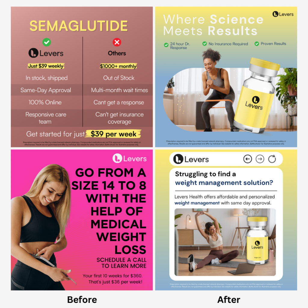
Previously, there had been more emphasize on the darker blue (#12315E) and red (#7F1111). The brand also experimented with a hot pink/ black/ white color scheme in hopes of better targeting their demographic; females 30+.
Before examples:


Refreshing The Brand Image & Voice
Brand Colors & Emotional Response
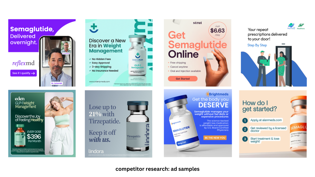
After doing competitor research and playing around with the color pallet, I shifted:
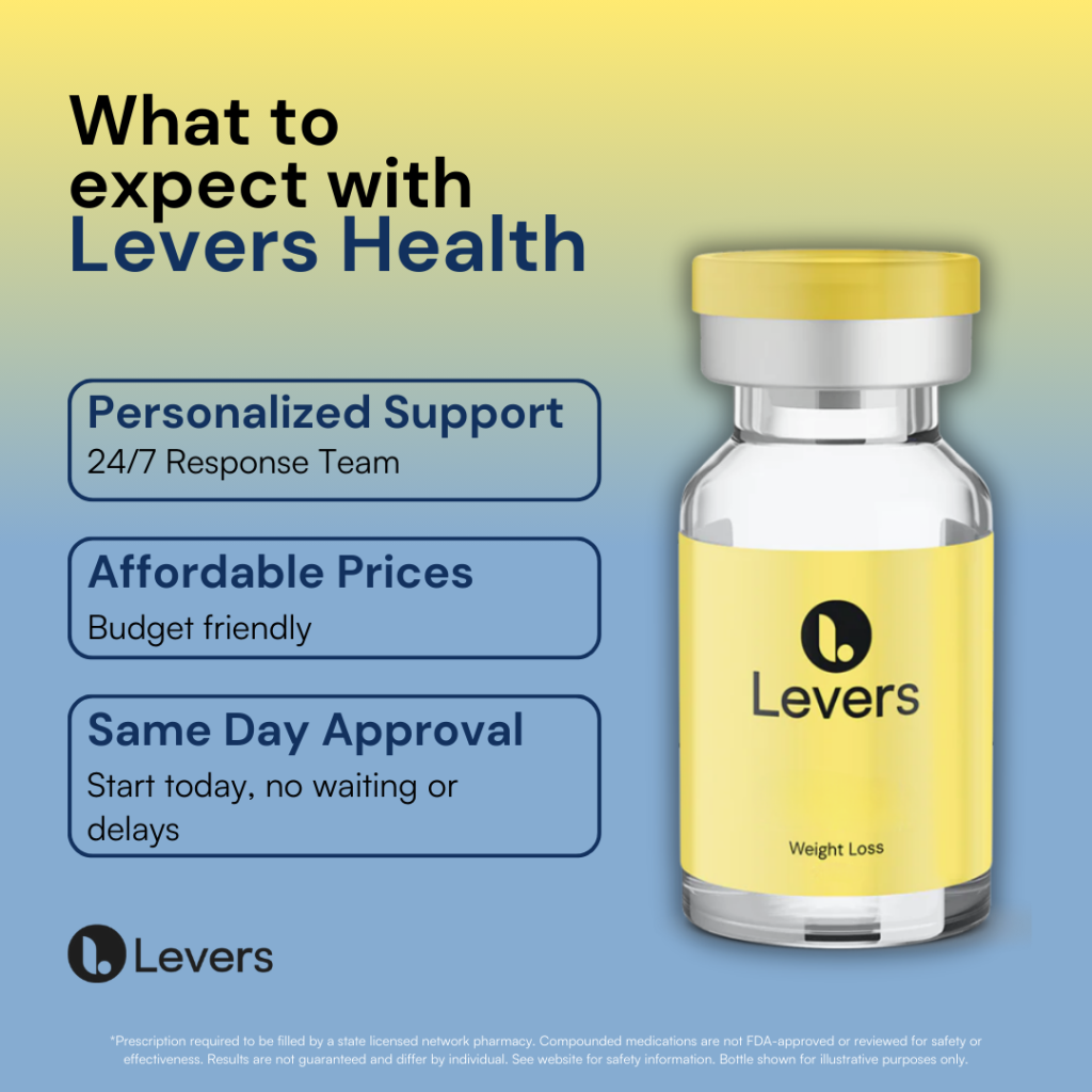
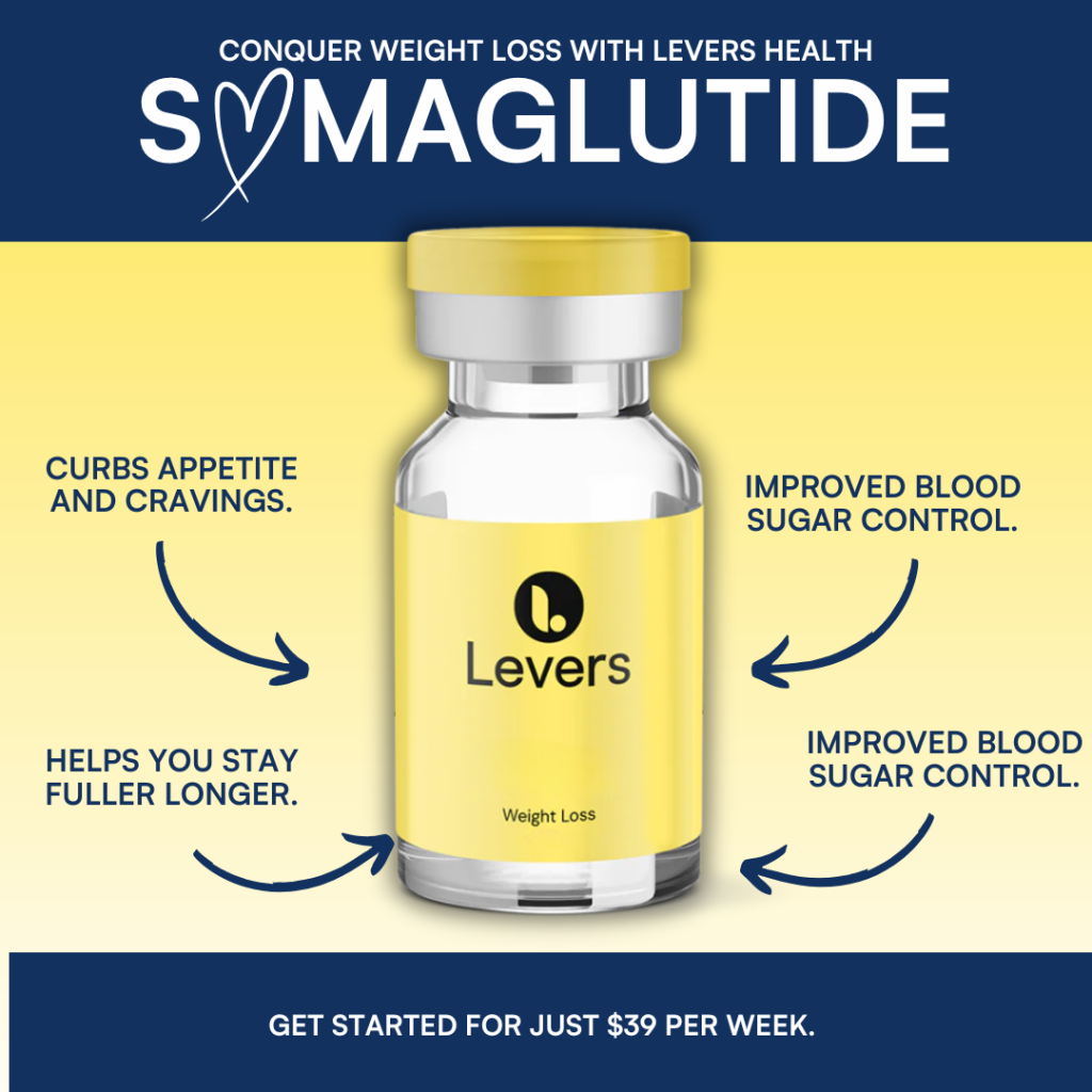
🟢 The main colors to the light blue (#86ACD1) and yellow (#FFEA71)
🟢 Created a gradient to intensify the emotional response & represent the emotional range
The lighter color scheme gives the brand:
🌞 Energy & happiness
💡 Lightness & optimism
🧗 Empowerment & motivating
🌻 Cheerful & friendly

Updating Brand Fonts
Updated fonts gives the brand a more modern look. Additionally, this helped to:
🕵️ Improve readability
🗣️ Support brand message & identity
🙋 Created a more playful & approachable tone



Brand Voice
Shifting the Messaging
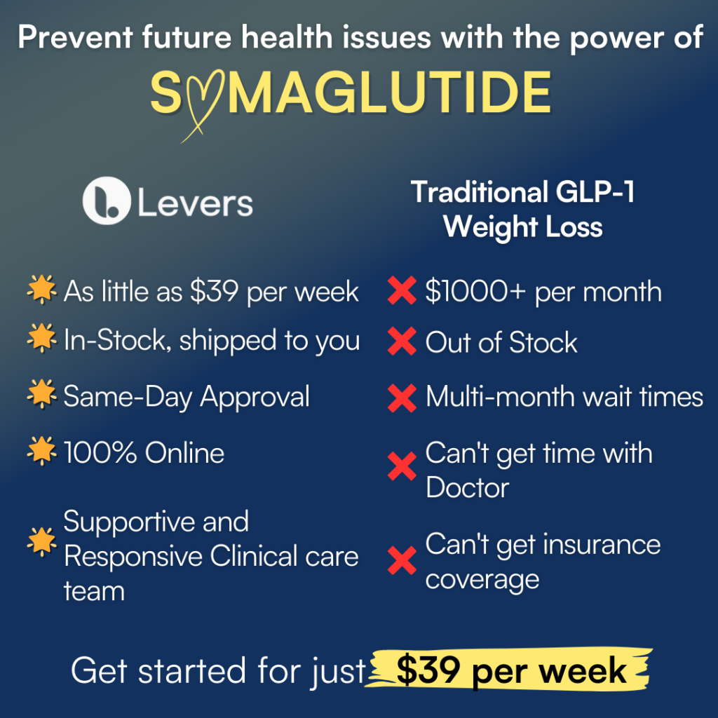
Another key part to repositioning the brand was shifting the messaging into a more subtle approach to weight loss. Additionally, online prescription medicine is extremely vulnerable to getting flagged, in particular- media surrounding weight loss practices.
Here is how I changed the copy to avoid being flagged, create a welcoming and non judgmental voice….
🎯 Shift the focus back to the objective services that Levers Health provides
🌟 Do not mention the struggle weight loss
Representing the Buyer
Originally, the Levers Health used photos of doctors in hopes of helping to establish the medical services the brand offers. The doctor avatar displayed did not resonate or create a friendly/ approachable feeling with our target audience.
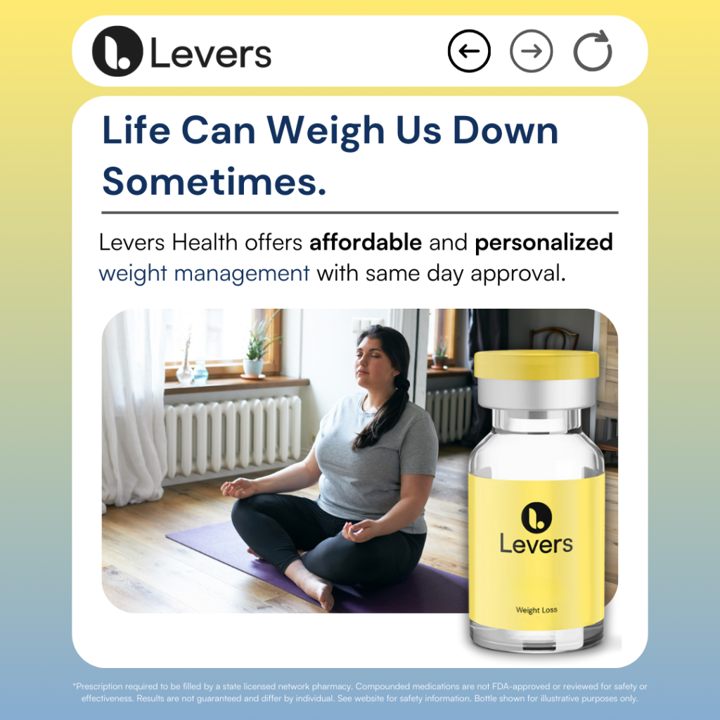
To create an approachable and friendly image, I choose photos that captured feelings of…
💪 Empowered
😃 Enjoyment
👆 Positive
✌️ Calm



Work Samples


